How to make responsive layouts in css (CSS GRID).

Written by Thomas Duffy
Today we’re going to be discussing how to build a responsive layout using one property of the CSS grid called grid-template-areas. In this post, we’ll be covering not only how to use grid-template-areas, but also the limitations of the property. Let’s get started.
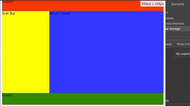
To see it in action, we’re going to start with this basic page markup that you’d typically see on a basic web page. Below we have a header, side-bar, main content, footer.
<html>
  <head>
    <title>
      CSS Grid areas
    </title>
    <link rel="stylesheet" href="styles.css" />
  </head>
  <body>
    <div class="grid-container">
      <header class="header">Header</header>
      <main class="main-content">
        Main Content
      </main>
      <aside class="side-bar">
        Side Bar
      </aside>
      <footer class="footer">
        Footer
      </footer>
    </div>
  </body>
</html>
Below, you’ll see i’ve defined some styles and assigned a color to the different sections so that we can see how the elements are laid out before applying our responsive grid-layout.
style.css
.header {
  background-color: red;
}
.main-content {
  background-color: blue;
}
.side-bar {
  background-color: yellow;
}
.footer {
  background-color: green;
}

To build a responsive layout using grid-template areas, we’re going to start by giving the parent div with the class of grid-container a width 100% and height of 100vh, which stands for view height and a display of grid.
.grid-container {
  width: 100%;
  height: 100vh;
  display: grid;
}
Next, we’re going to give the sections of our layout names using the property grid-area, which will be used to define our grid layout in the parent container. You can name these whatever you want, but its always good to be as descriptive as possible.
.header {
  background-color: red;
  grid-area: header;
}
.main-content {
  background-color: blue;
  grid-area: main;
}
.side-bar {
  background-color: yellow;
  grid-area: side-bar;
}
.footer {
  background-color: green;
  grid-area: footer;
}
Now that our sections have names, we can now define our layout using grid-template-areas.
The syntax is a little strange, but it’s actually really nice to read. You create the layout using the names we gave the sections earlier.
So if we want a three col layout with five rows, we can define it like this.
.container {
  width: 100%;
  height: 100vh;
  display: grid;
  grid-template-areas:
    'header header header'
    'side-bar main main'
    'side-bar main main'
    'side-bar main main'
    'footer footer footer';
}

As you can see, the section names we defined using grid-area correspond with the definition above. This tells the browser how to lay out the sections we set.
Next, let’s say you wanted to give the header an explicit height; you can do this by coupling the use of grid-template-rows along with grid-template-areas.
It’s essential to note that the values have to correspond with what you put in the grid-template-areas property, so the number of values has to match what you put in grid-template-areas.
The same goes for if you wanted to do some styling on a specific column, you would use grid-template-columns.
.container {
  width: 100%;
  height: 100vh;
  display: grid;
  grid-template-areas:
    'header header header'
    'side-bar main main'
    'side-bar main main'
    'side-bar main main'
    'footer footer footer';

  grid-template-rows: 50px 1fr 1fr 1fr 50px;
  grid-template-columns: 200px 1fr 1fr;
}

Above, you can now see the styles we applied using grid-template-rows and grid-template-columns applied to the header and footer.
Things to watch out for
A couple of gotchas with the grid-template-areas are the following.
You can’t duplicate sections in the definition.
.container {
  grid-template-areas:
    'header header header'
    'side-bar main main'
    'side-bar main main'
    'side-bar main main'
    'header header header';
}
You must define your layout with a complete grid, meaning you can’t leave any empty gaps in the section definitions, you must do it with a . or …
The wrong way
.container {
  grid-template-areas:
    'header header '
    'side-bar main main'
    'side-bar main main'
    'side-bar main main'
    'header header header';
}
The right way
.container {
  grid-template-areas:
    'header header ...'
    'side-bar main main'
    'side-bar main main'
    'side-bar main main'
    'header header header';
}

You also have to define your sections respecting the box-model of a div. So you can’t make a section an L shape or something like this.
Wrong
.container {
  grid-template-areas:
    'header header header'
    'side-bar main main'
    'side-bar main main'
    'side-bar main footer'
    'footer footer footer';
}
Elements are NOT reordered in the DOM.
Although the order of an element may render in the order or position you define, the order and position of the elements do not change in the DOM.
Wait, what about making it responsive?
Now last but not least, let’s see how easy it is to make this layout responsive.
@media screen and (max-width: 660px) {
  .grid-container {
    grid-template-areas:
      'header'
      'main'
      'main'
      'main'
      'side-bar'
      'footer';
  }
}
As you can see, with a simple media query, we can redefine the .grid-container to reflect a mobile layout, annnnd we’re done.