Centering items in css grid.
Written by Thomas Duffy
CSS grid has revolutionized the way we build grid layouts on the web. When creating grid layouts centering items is a common task. In this post, I’ll show you how to center and align-items when using the CSS grid.
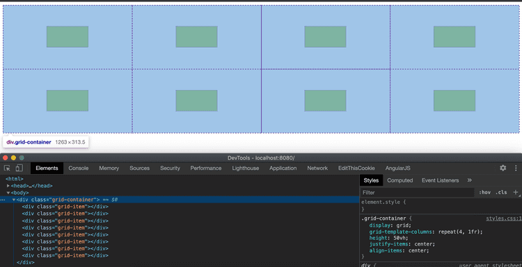
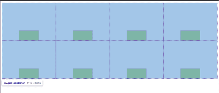
The first scenario we’ll talk about is when we want to center all child elements inside their respective grid-cell—something like in the image below.
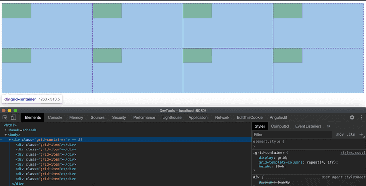
Below, I have an example of some markup and CSS with a grid container with four columns and two rows. With-in each grid-cell, we have a child element.
<html>
  <link href="styles.css" rel="stylesheet" />
  <body>
    <div class="grid-container">
      <div class="grid-item"></div>
      <div class="grid-item"></div>
      <div class="grid-item"></div>
      <div class="grid-item"></div>
      <div class="grid-item"></div>
      <div class="grid-item"></div>
      <div class="grid-item"></div>
      <div class="grid-item"></div>
    </div>
  </body>
</html>
.grid-container {
display: grid;
grid-template-columns: repeat(4, 1fr);
height: 50vh;
}
.grid-item {
width: 100px;
height: 50px;
border: 1px dotted purple;
background: yellowgreen;
}Horizontally centering and aligning all items in a grid-container
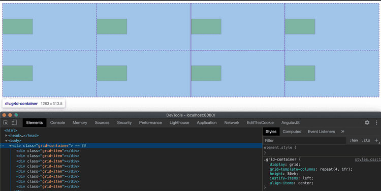
Similar to flex-box, we’ll have to use two separate properties to center the elements both vertically and horizontally.
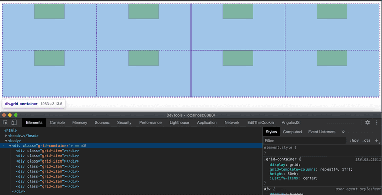
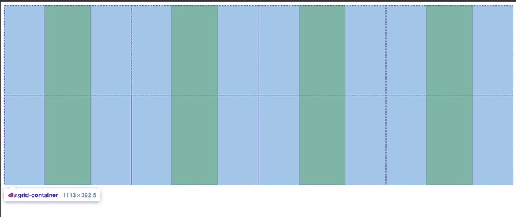
To center the item horizontally or on the x-axis, we give the grid container the property of justify-items and give it a center value.
.grid-container {
  display: grid;
  grid-template-columns: repeat(4, 1fr);
  height: 50vh;
  justify-items: center;
}
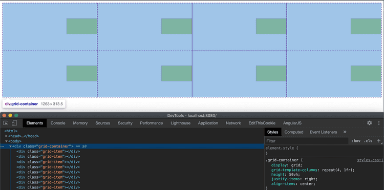
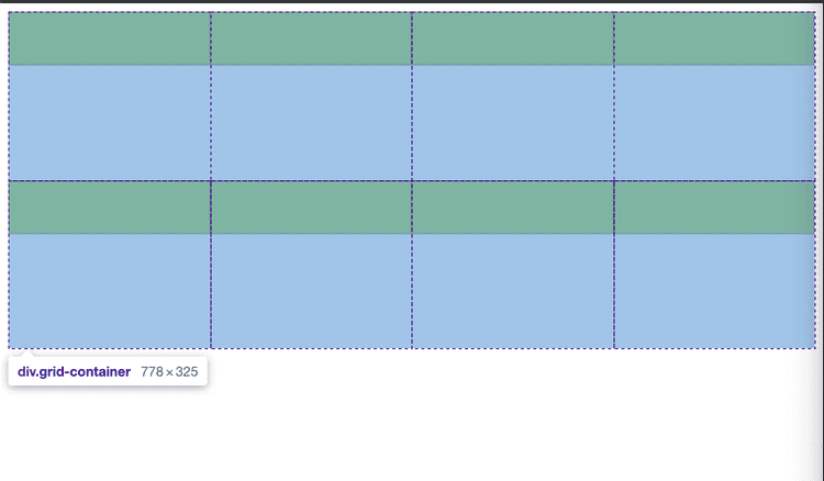
If you wanted to align the items at different points of the grid-cell, justify-items also takes three other values, start | end and stretch.
.grid-container {
  justify-items: start | end | center | stretch;
}
justify-item:start
justify-item:end
justify-item:strech
Vertically centering and aligning all items in a grid-container
Now, let’s align the items vertically.
We can use the align-items property for vertical alignment or aligning on the y-axis and set it to… you guessed it, center.
.grid-container {
  display: grid;
  grid-template-columns: repeat(4, 1fr);
  height: 50vh;
  justify-items: center;
  align-items: center;
}
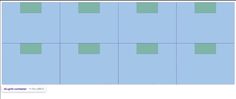
The property align-items also take the same properties as justify-items, which are the following.
.grid-container {
  align-items: start | end | center | stretch;
}
align-items: center
align-items: start
align-items: end
align-items: strech
Align Grid items independent of the grid-container
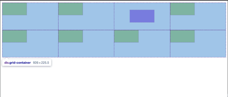
The second scenario is if you want to align the items independently of the other grid cells. For example;
Horizontal grid-item centering
We also have two specific properties for horizontal and vertical alignment to center a single item within a grid-cell. We would add the property justify-self: center to the item we are aligning in the grid-cell for horizontal centering.
example code of justify-center
.grid-item-c {
  width: 100px;
  height: 50px;
  border: 1px dotted purple;
  background: blueviolet;
  justify-self: center;
}
Vertical grid-item centering
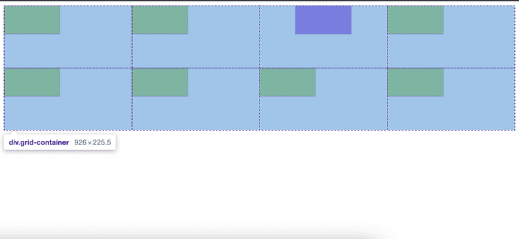
Now, let’s center the item in the cell vertically using the align-self: center.
.grid-item-c {
  width: 100px;
  height: 50px;
  border: 1px dotted purple;
  background: blueviolet;
  justify-self: center;
  align-self: center;
}
Both of the properties also have other alignment options and take the same values as align-items and justify-items.
.justify-self {
  justify-self: start | end | center | stretch;
}

.align-self {
  align-self: start | end | center | stretch;
}
Which give you full control over where you place an item in the grid cell
Shorthand way to center and align grid-cell item
Finally, there is a shorthand way to align or center an item in a grid cell. We can use the place-self and pass in the x and y values like this.
.grid-item-b {
  width: 100px;
  height: 50px;
  border: 1px dotted purple;
  background: blueviolet;
  place-self: center stretch;
}
conclusion
That’s it for centering items within a grid! I hope you enjoyed this post!
