How to overlay divs without absolute positioning it.

Written by Thomas Duffy
A common task while styling HTML is overlaying two divs. The job could be overlaying some text over an image, or popping a modal over the top of an overlay. In this post, we’ll cover how to accomplish overlaying two divs without having to use position:absolute.
Why not just make the div position:absolute?
First things first, I want to make it clear that using position:absolute is entirely acceptable to complete the task of overlaying two divs. This topic is commonly brought up because when positioning an element with position:absolute it removes the element from the natural flow of the document, which can make it challenging to manage. Still, it doesn’t mean its wrong by any means.
The cleaner way!
In the above paragraph, I stated that it’s not wrong to use position:absolute to overlay two divs, but something to also mention is, just because it’s not wrong doesn’t mean it won’t make you want to take a shower after using it. Ok, it’s not that bad, but there is a cleaner way! Lets look at how to get the job done with the fantastic new powerful CSS grid layout system.
Example
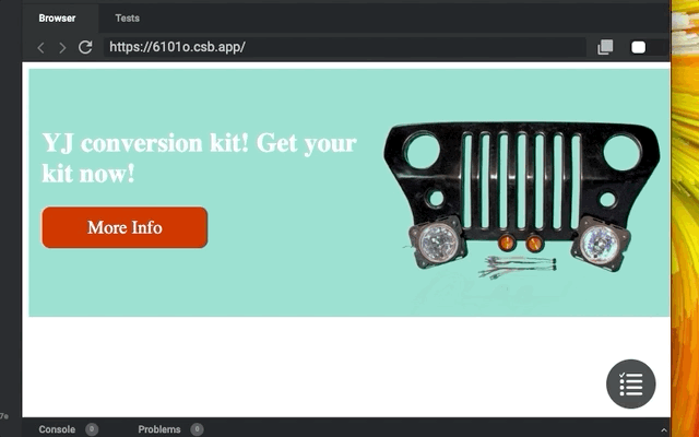
Below is an example when you would have to overlay two divs. The example is a hero banner with a title and a product image. The requirements are that It needs to be responsive and allow the title to overlay the image at smaller screen sizes.
The solution using Grid
Before Grid Layout came along, most people would set the right div to position: absolute, taking the div out of the document flow and requiring the left element to ignore the position of the right element. With Grid, you can assign the divs to live on the same columns and rows, resulting in the same effect while keeping both elements in the natural document flow. Let’s take a look at the code.
HTML
<div class="container">
  <div class="left-content">
    <h1>YJ conversion kit! Get your kit now!</h1>
    <div class="cta-button">More Info</div>
  </div>
  <div class="product-image"></div>
</div>
Above is the HTML for our hero banner. We have a container with two divs as children. The element with the class of .left-content is going to wrap our title and call to action button, the element with the class of .product-image is going to contain, well, you guessed it, our product image.
CSS
The first thing we need to do is give the container wrapping all the elements the property of display: grid, which will allow us to apply all the other necessary styles to its children to accomplish the overlaying effect. Next, we have to define the grid columns and rows. We can do this by using the grid-template-columns and grid-template-rows. In this example, we’ll use a 4 column layout with one row. To make this responsive, we can use the fr shorthand to declare that you want all your columns to take up the available space in the container. Then, we’ll define the grid rows. With this example, we only want one row.
.container {
  display: grid;
  grid-template-columns: 1fr 1 fr 1fr 1fr;
  grid-template-rows: 1fr;
  height: 300px;
}
 The above CSS will give us our columns and rows.
Next, let’s position our elements inside the container. First, we’ll target the .left-content class. Instead of giving the element a width, we need to define what rows and columns we want this element to span across. The way we can do this is by using grid-column-start, grid -column-end, grid-row-start, and grid-row-end.
.left-content {
  grid-column-start: 1;
  grid-column-end: 3;
  grid-row-start: 1;
  z-index: 2;
  padding-left: 16px;
}
Lets break down the above CSS. By setting grid-column-start to 1 and grid-column-end to 3 we are saying that we want this element to span across column 1 to the beginning of column 3. So basically 50% of the container. You maybe asking, why define grid-row-start if you only have 1 row? We have to define grid-row-start because the browser will dynamically create new rows and automatically place each element on that row. Defining both elements to grid-row-start: 1 will force the two elements to be on the same row.

Next, let’s position our product image.
.product-image {
  grid-column-start: 2;
  grid-column-end: 5;
  grid-row-start: 1;
  background-image: url('./src/example-image.png');
  background-position: right bottom;
  background-repeat: no-repeat;
  background-size: contain;
  z-index: 1;
}
So this is where the magic happens. By setting this element to grid-column-start to 2, we are assigning this div to one of the same columns as the first element, allowing the overlapping effect to take place without using absolute.

Conclusion
To recap, all we have to do is define what row and column to start and end. Then the div will automatically span across the defined grid columns and rows. Since we only have one row, we are not setting the grid-row-end , but we still have to define grid-row-end, or the browser will automatically create multiple rows dynamically. I hope you enjoyed this article on how to overlap two divs using the new Grid layout system!